Hands-on learning.
Research – Concept – Prototype
subtitles
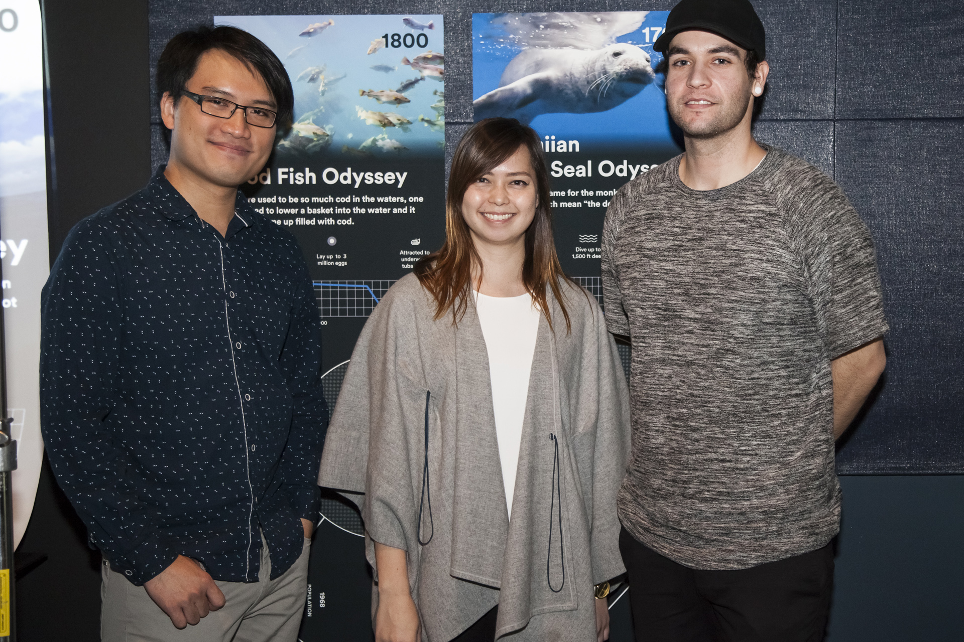
In partnership with the Aquarium of the Pacific, we learned how to channel the power of storytelling into communicating impending environmental issues.
Linh Ho
Interaction Design
Naomi Tirronen
Graphic Design
Matt Benkert
Graphic Design
My Role
40%
User Experience Design40%
User Interface Design20%
ProgrammingThe Topic
One ocean under threat.
keyboard_arrow_up We listened to scientists & experts in the field
We also shared experiences of our own keyboard_arrow_down
The Reality
More than 10,000 species are at risk of extinction every year, among them a swelling number of marine animals.
keyboard_arrow_up WARNING: Graphic images. Footage taken aboard the whaling ship Nissin Maru
Humans have profoundly decreased the abundance of both large (e.g., whales) and small (e.g., anchovies) marine fauna. Such declines can generate waves of ecological change that travel both up and down marine food webs and can alter ocean ecosystem functioning. Climate change threatens to accelerate marine defaunation over the next century.
arrow_downward
Douglas McCauley
Marine Biologist | UCSB
#1
Wildlife populations in the oceans have been badly damaged by human activities.
#2
We may be sitting on a precipice of a major extinction event.
#3
We should act quickly to slow the advance of marine defaunation.
The Process
Doubling down on diamonds.
keyboard_arrow_up Blue Hope’s Double Diamond Process
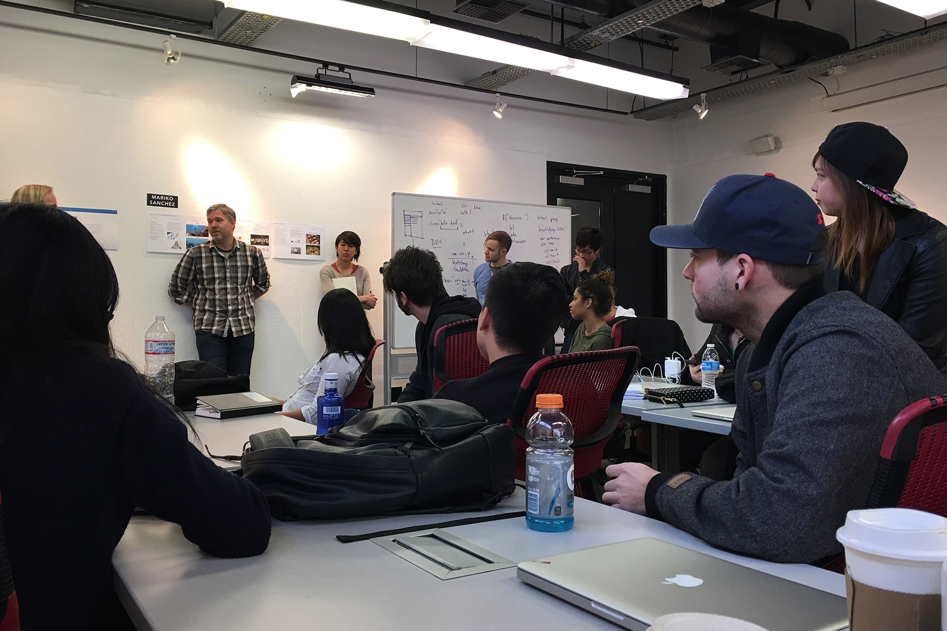
Since we would be meeting with clients on a bi-weekly basis, we decided early on in the process to utilize the double-diamond methodology into our process.
keyboard_arrow_down Brainstorm sessions
keyboard_arrow_down Client visits
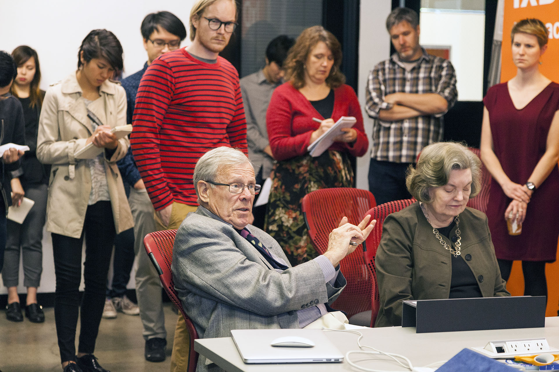
This involved rapidly generating lots of different ideas in the initial phase; then, with feedback from the client, we would continue to refine and filter down to surface more potent ones.
keyboard_arrow_down Battle plan
Week 1
Meet and greet with scientists and experts.
Week 2-3
Brainstorming various ideas.
Week 4-5
Client meeting, bounce off best of ideas.
Further refine finalists.
Week 6
Conclude ideation phase, begin building prototype.
Week 7-11
Conduct usability tests, verify UX assumptions and revise prototype as needed.
Week 12
Prepare prototype for stakeholder presentation.
Design Criteria
Within the fast-paced and iterative creative process, we established a clear goal and set design criteria for the project for the weeks to come. These guides, though simple, often came in handy for re-evaluating our concepts.
Examples:
- This idea is cool but does it successfully communicate the reality in a clear and engaging manner?
- That being asked, what do we use to differentiate levels of engagement?
- How memorable is the interaction? Can we measure it?
- What are the potential call-to-actions?
arrow_downward
my_location
Communicate the story of vanishing marine animals
pan_tool
via an engaging and memorable interaction.
Humpback Odyssey
A story of great recovery.
On Content
Instead of capitalizing on the tragedies, we chose to tell the humpback whales’ great comeback story, notably during the last 40 years.
Their resilience and a strong recovery in population is proof that a coalition of international policy-making efforts and collective human activism can make a big difference.
arrow_downward
Initial Render keyboard_arrow_down
keyboard_arrow_up Principal Interaction Model
On Form
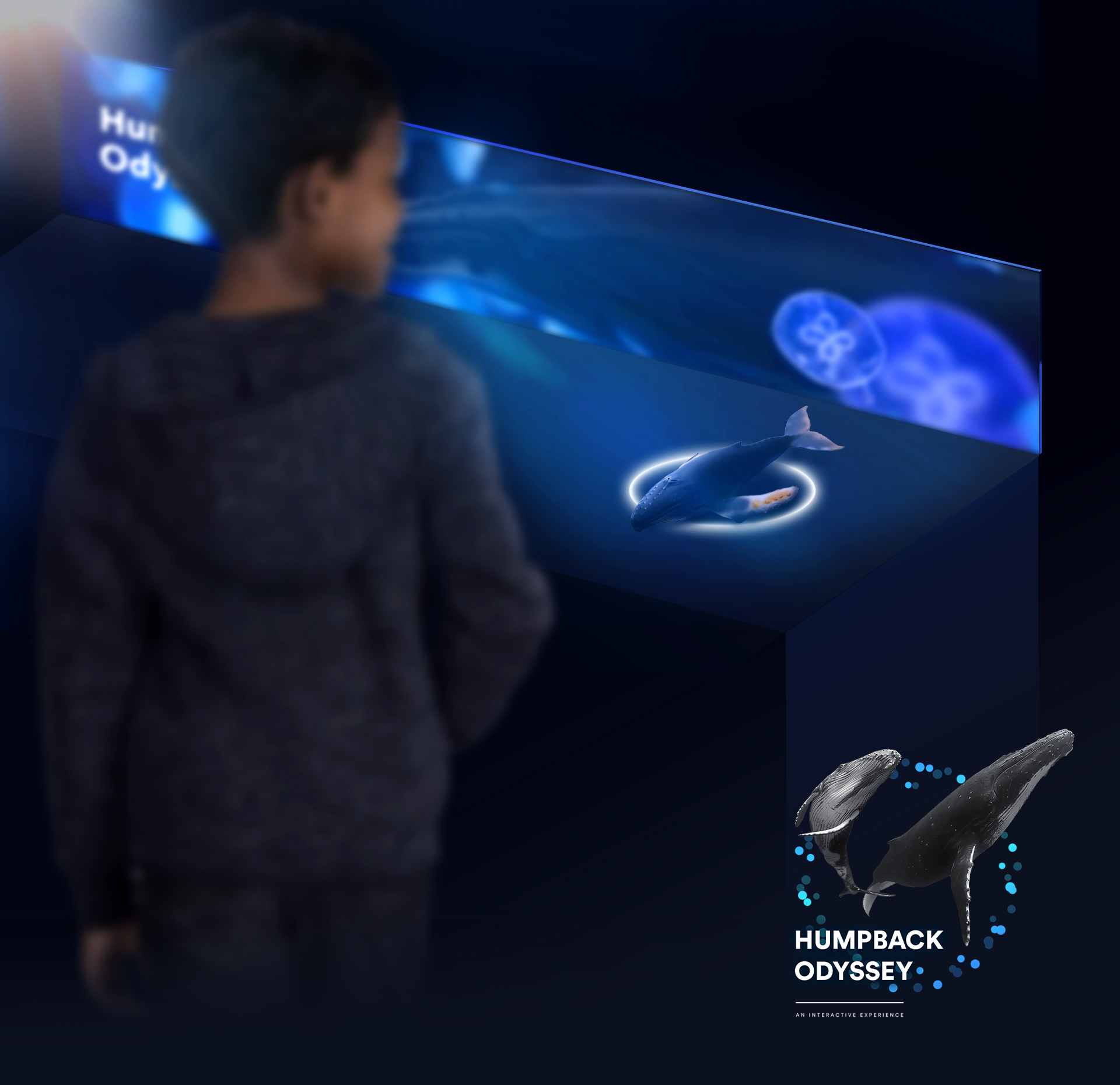
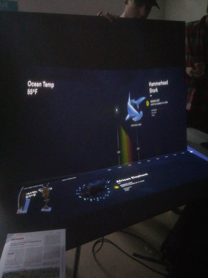
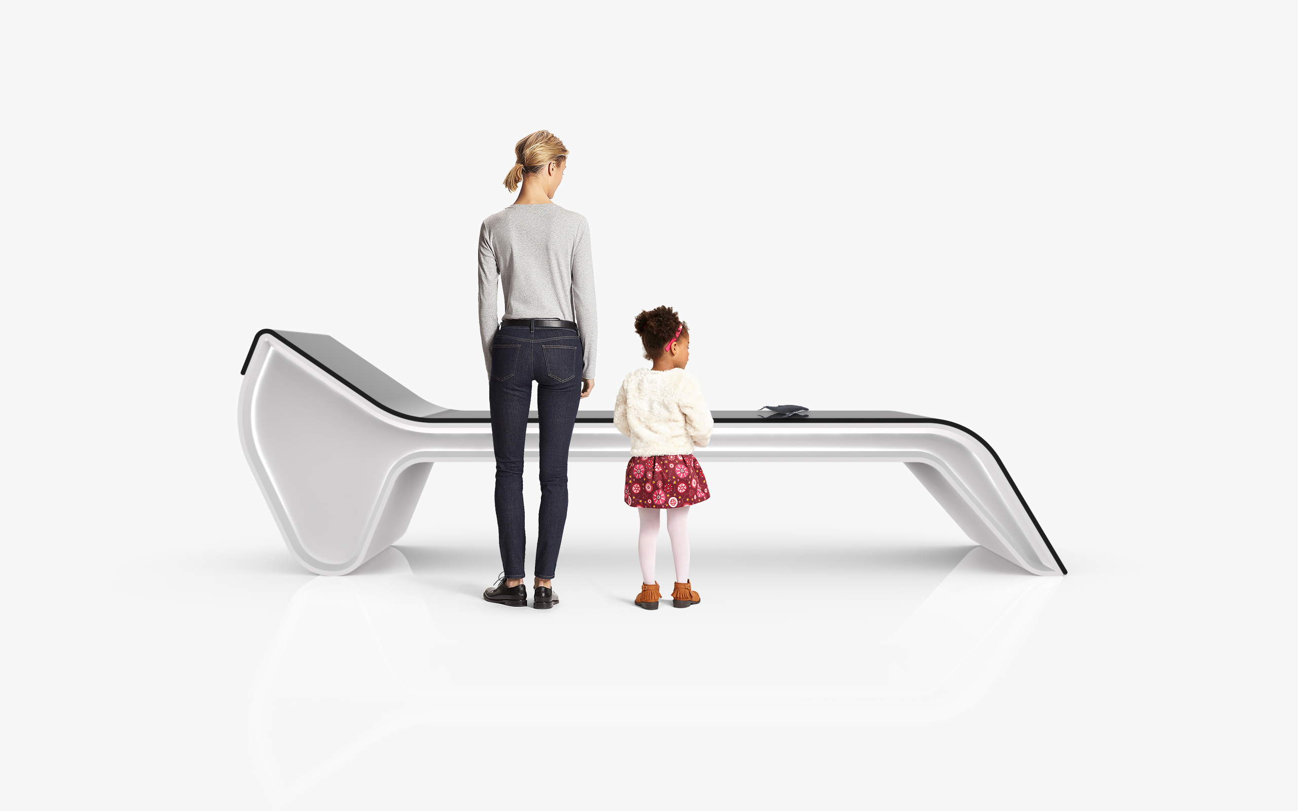
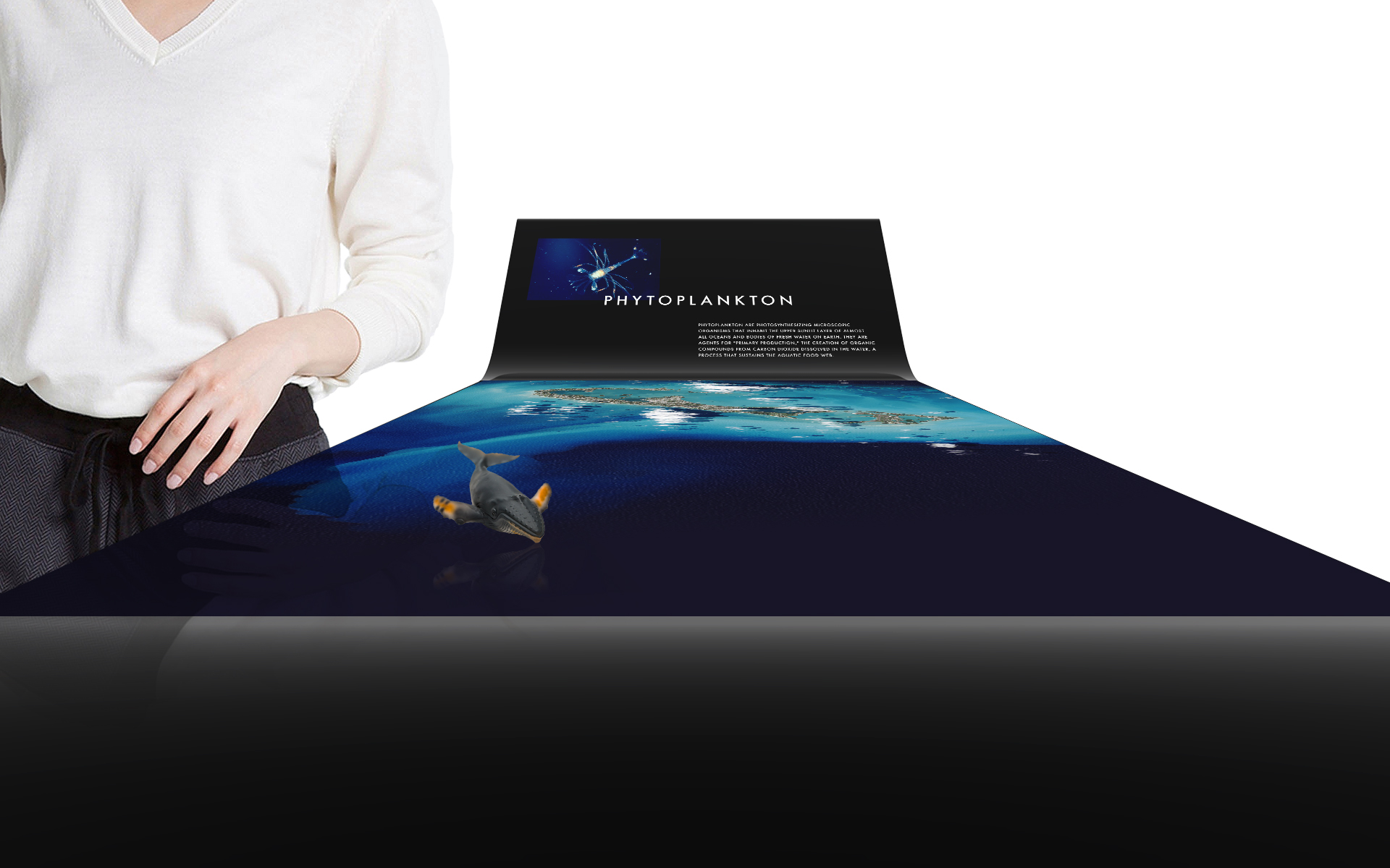
After a few iterations, we found out that the optimal form factor consisted of two planes conjoined at an angle equal or greater than 90 degrees.
To accomodate both adults and children of small sizes, the angle of the joint would become more dramatic as the bottom plane moved closer to ground. Hollowing out the supporting structure for the bottom plane was also considered for better wheelchair support.
User Insight
The setup is perfect for a shared experience in which the parent assumes the co-pilot position while the child is the main driver of the narrative.
arrow_downward
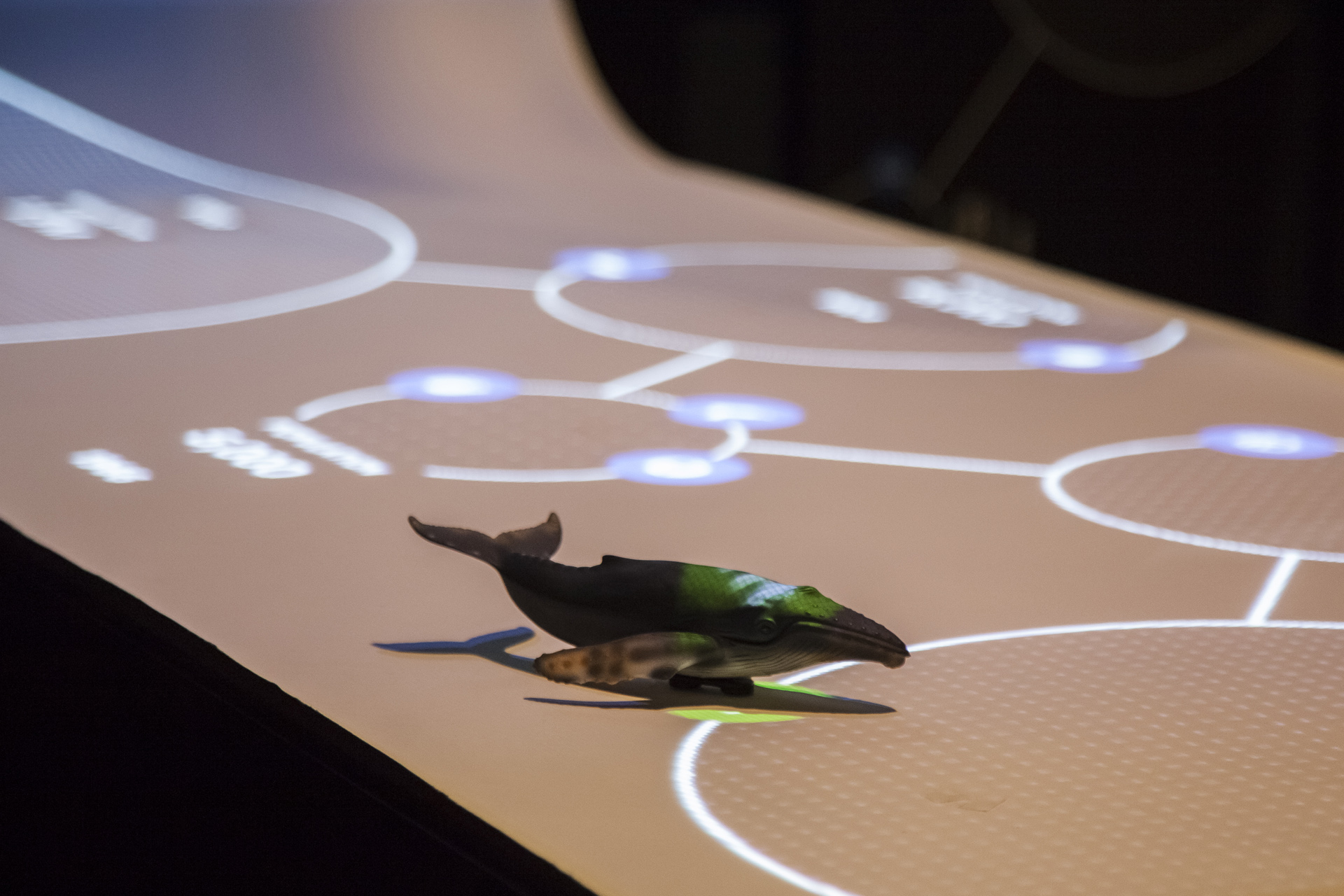
keyboard_arrow_up Control the timeline with an animal figurine
Learn about the species’ history keyboard_arrow_down
keyboard_arrow_up Initial Prototype
Crude and humble as it was, our first prototype served beautifully as the first foray into the heart and mind of our users.
Insight
Upon seeing users interact with the mockup, we believed we had found an intuitive way to communicate our story.
keyboard_arrow_down User testing results
keyboard_arrow_down Key Takeaways
keyboard_arrow_down Card sorting with users
IA
We quickly assembled another prototype consisted simply of color-coded post-its so our users can begin sorting data into various ‘tiers.’
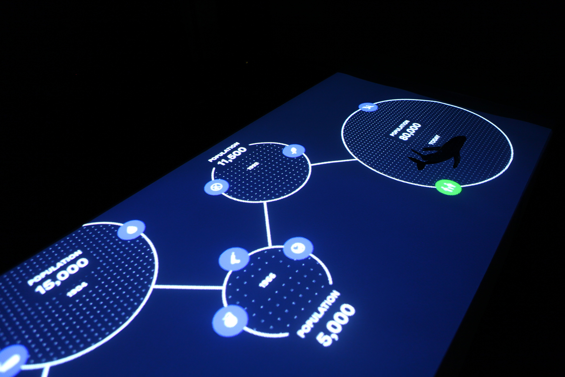
These user-generated data groupings became ‘hotspots’ — the underlying foundation upon which we built our interactive timeline.
Paper Prototyping keyboard_arrow_up
keyboard_arrow_down Rejected direction
keyboard_arrow_down Rejected direction
Wait A Minute
The latest iteration of our prototype bore a striking resemblance to that of an arcade or pinball machine.
No wonder why we'd been getting a lot of curious questions from passerby’s when we're building it.
arrow_downward
keyboard_arrow_down Final direction
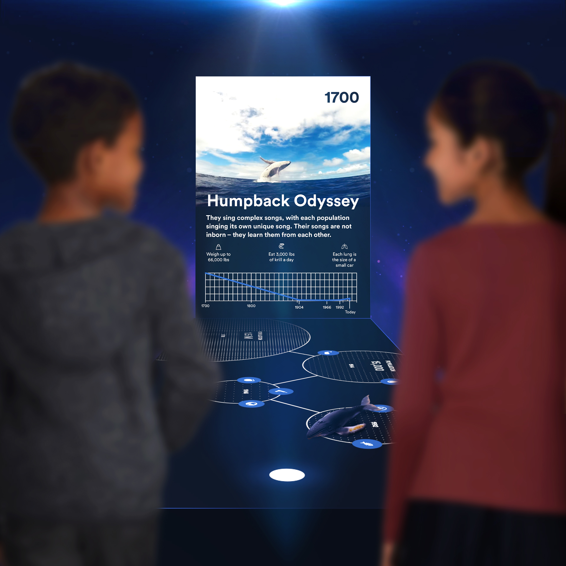
On Tactility
Why use objects?
pan_tool
Haptic
memory
Memory
toys
Imagination
Touching an actual object stimulates different regions of the brain, making the experience more memorable than being told a fact or simply staring at a screen.
To a child’s mind, the toy whale has the potential to become so much more than what meets the eye.
arrow_downward
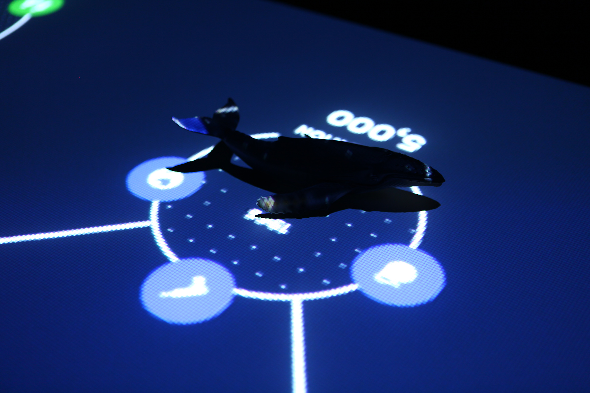
keyboard_arrow_up Picking up the figurine
Placing it onto a hotspot keyboard_arrow_down
How it works
blur_on
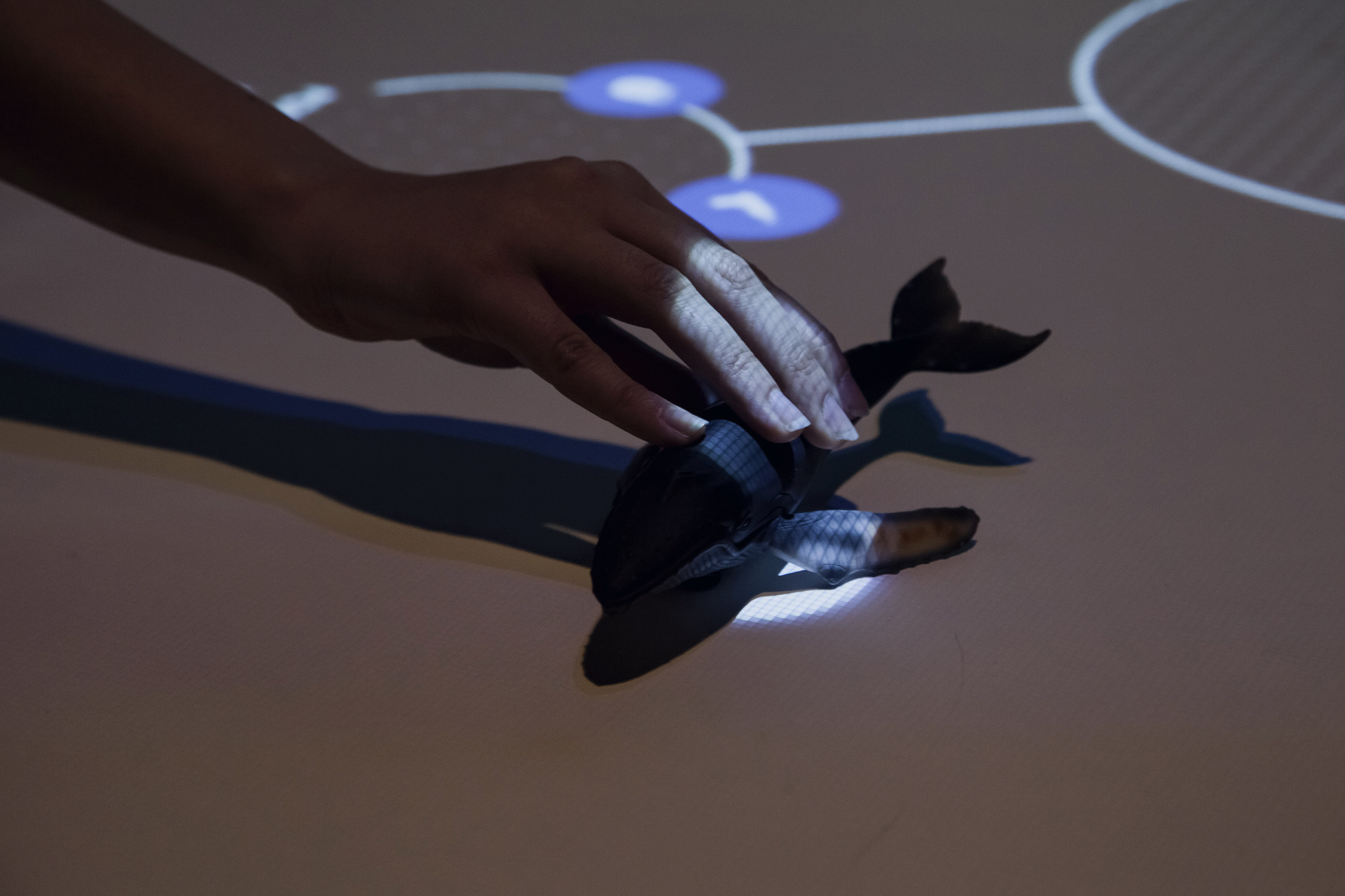
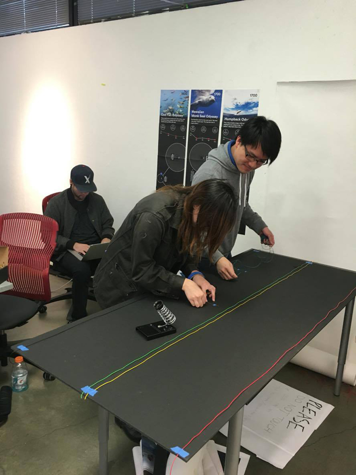
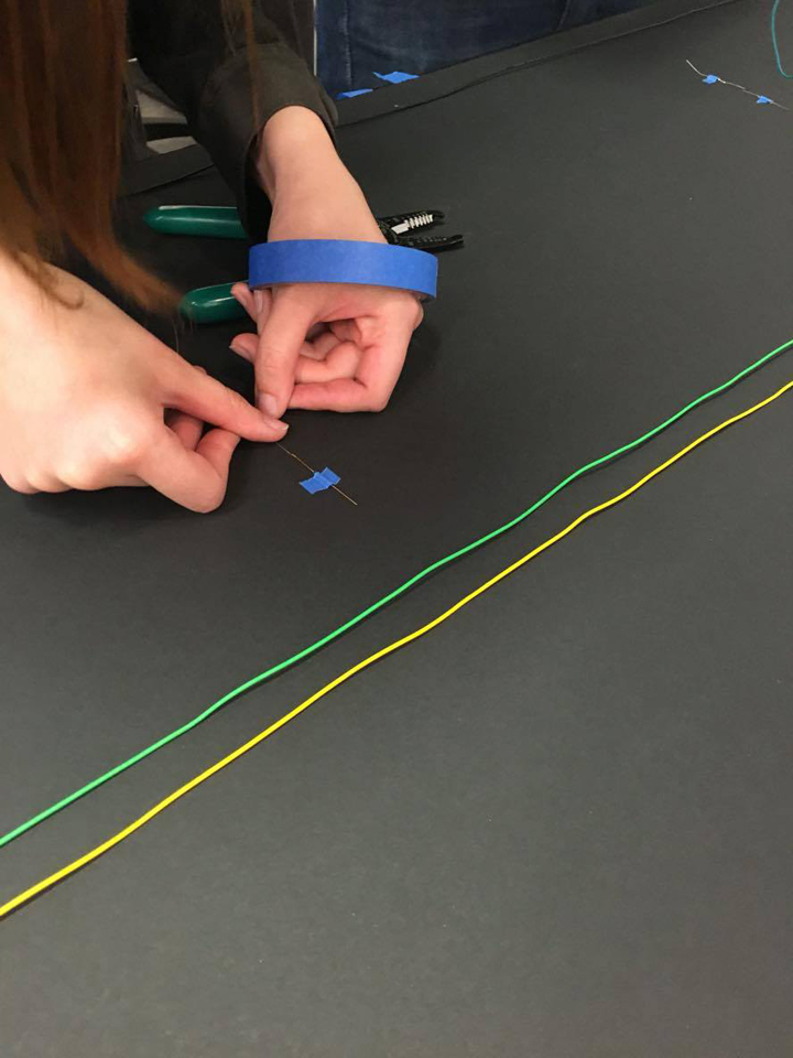
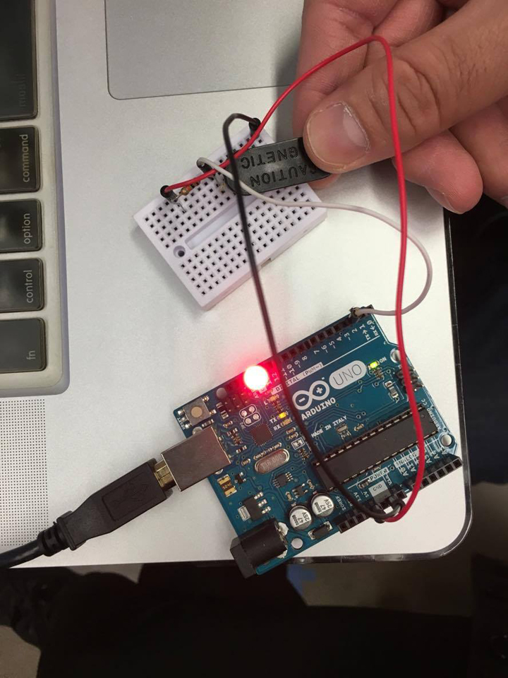
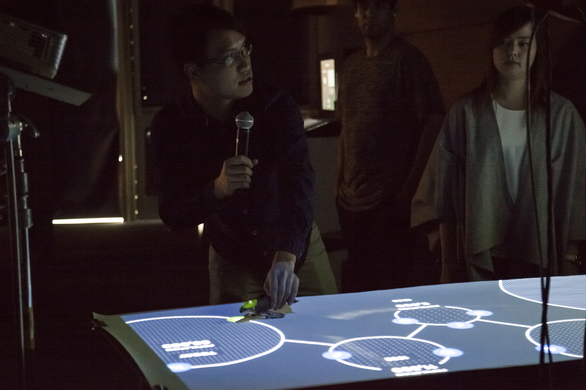
PreSense is a network of magnetic sensitive sensors (aka Reed switches) that captures the X and Y coordinates of a magnetically-charged object on a plane and reports the numbers back to an embedded computer.
visibility
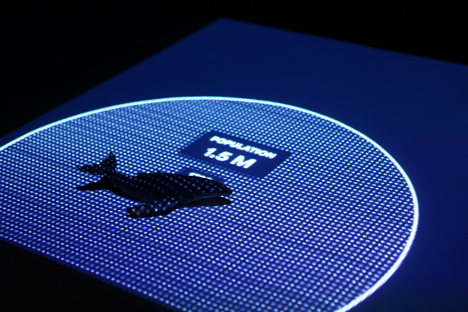
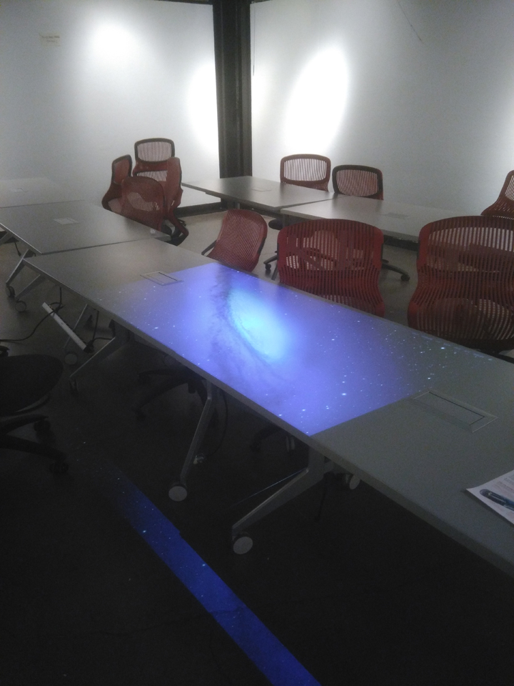
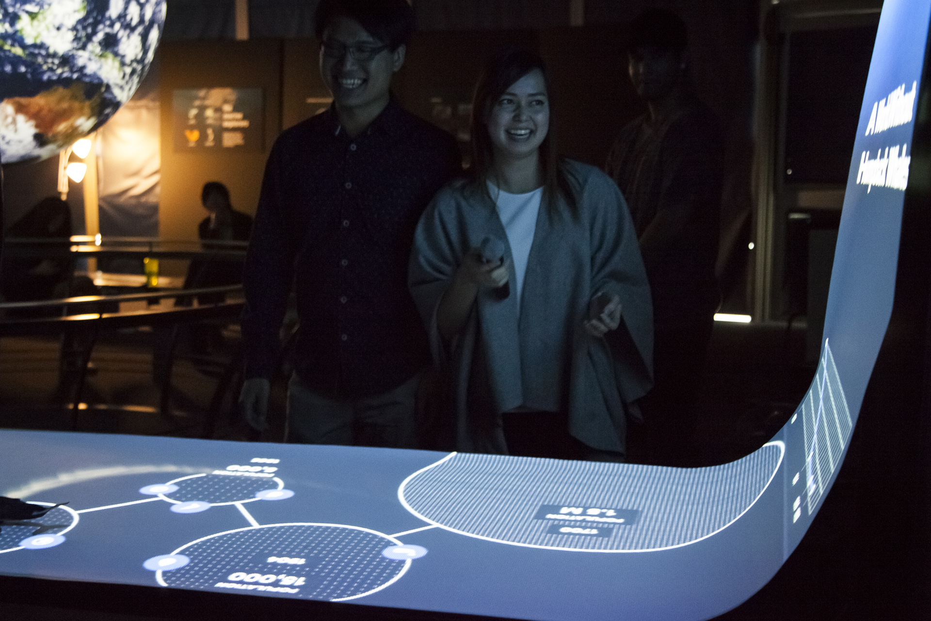
Projection Mapping The onboard computer processes the object's coordinates and render out the corresponding graphics, which get projected back onto the plane on which the object is placed.
keyboard_arrow_down Actual Scene
keyboard_arrow_down Mapped Output
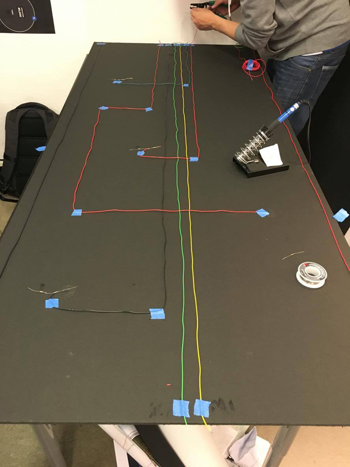
It's Soldering Time
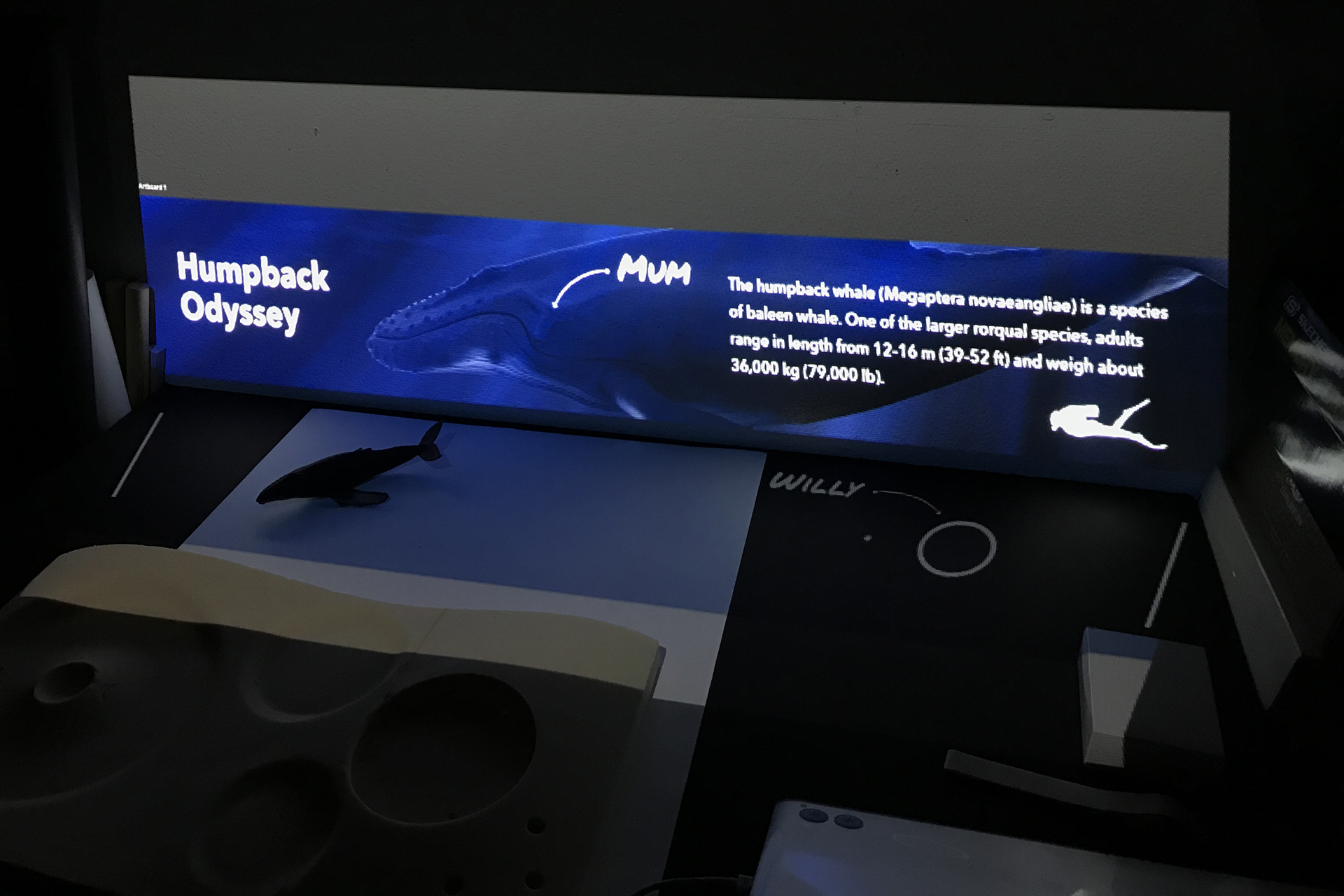
We created several prototypes to explore the desirable interaction.
arrow_downward
Final Presentation
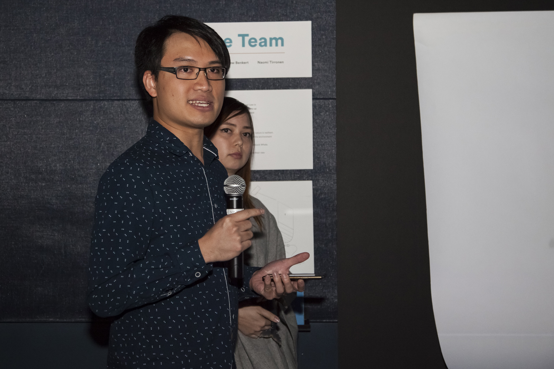
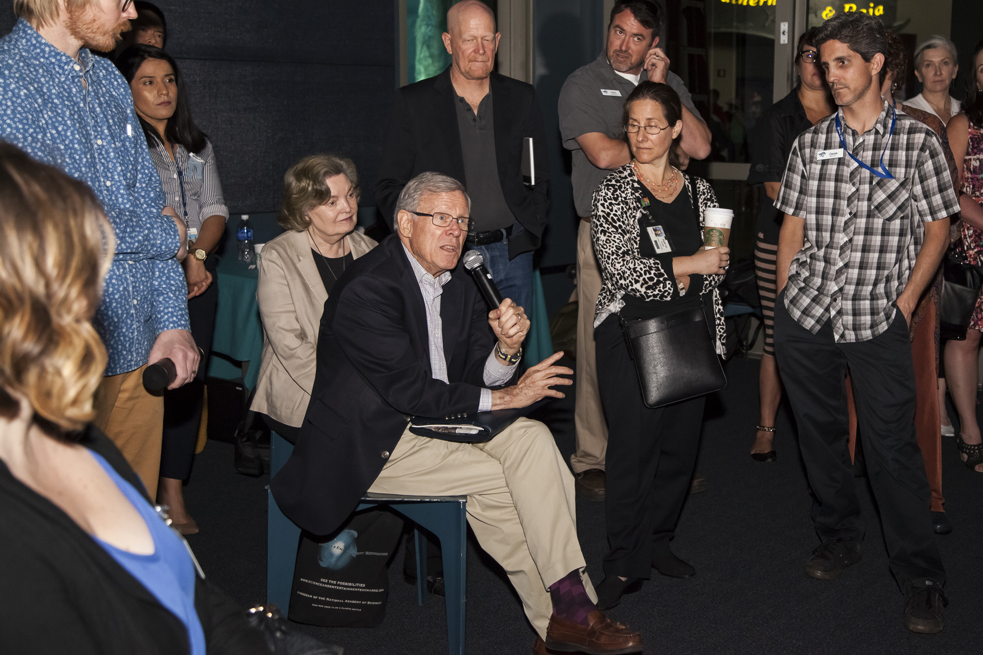
The working prototype was presented to an audience of marine scientists, geologists, exhibition designers, and city officials at the Aquarium of the Pacific in Long Beach.
arrow_downward
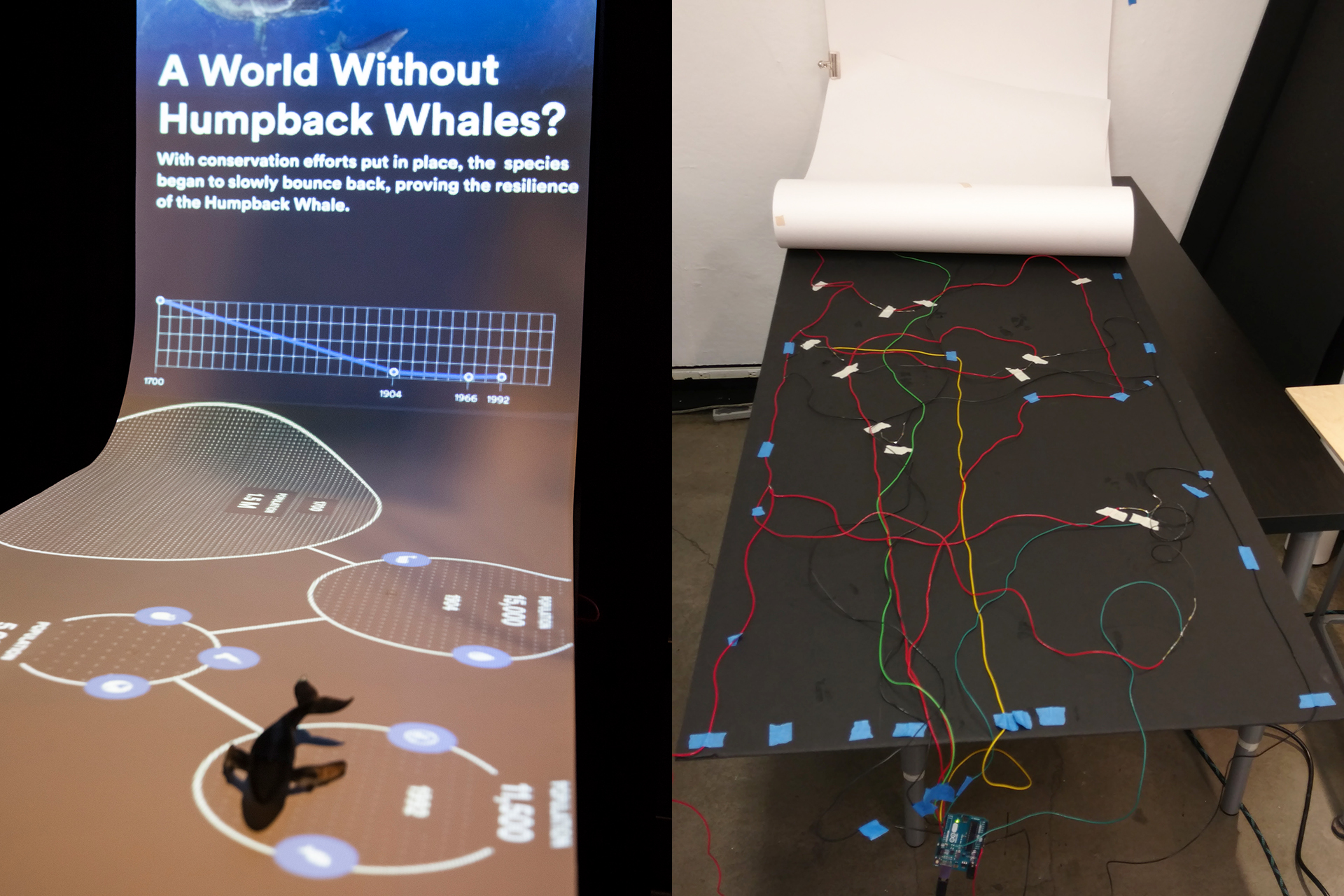
A sneak peek behind the curtains keyboard_arrow_up
What happened to Willy?
Our star of the show — Willy the humpback whale — now lives with one of our team members in her apartment in LA.
arrow_downward
